Asana architecture
2015
As Asana grew in functionality, we were finding that the early simplicity of the product no longer held true. Users were having trouble finding features and reported a general feeling of being overwhelmed. We had a vision of being a powerful and flexible tool, so we knew we needed to do something to make the experience more extensible, give our users the features they were asking for, and prepare to better meet the needs of the larger and more traditional companies we had begun to attract.
Defining the problem
Asana was born as a simple task list and detail view, shown side by side to facilitate quick navigation, editing, and information gathering. The design was simple and the majority of the functionality was accessible on single screen. However, as we added new views and features, such as calendars, progress reports, and conversations, the elegance of the single screen became a hindrance. The entry points to the new features were getting lost in the morass of navigation, the hierarchy of the page was unclear, and it was becoming more and more difficult for the design team to do good work.
As each of these new features was being developed, the designer and PM struggled with the architecture of the product. Weeks were wasted debating the scope of the project in attempts to find solutions to the problem, struggling with viable and launchable solutions, and eventually building and launching a sub-par experience that our customers found unclear.
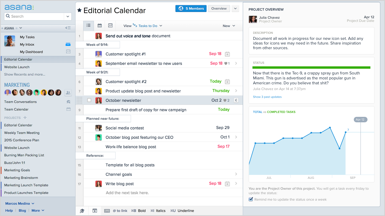
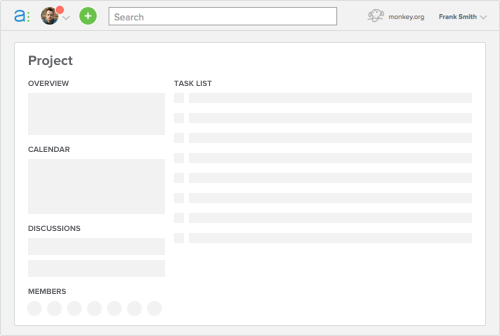
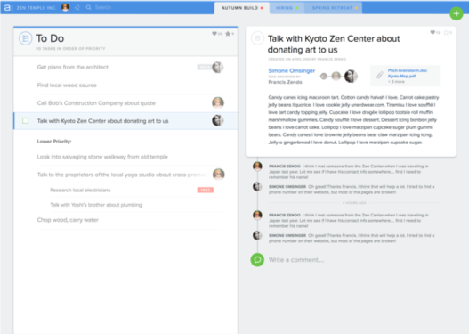
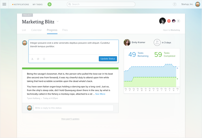
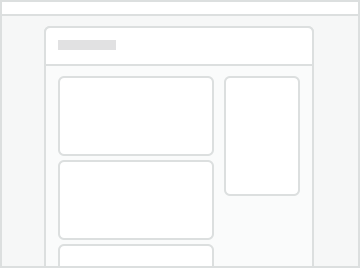
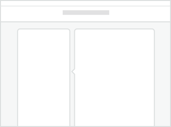
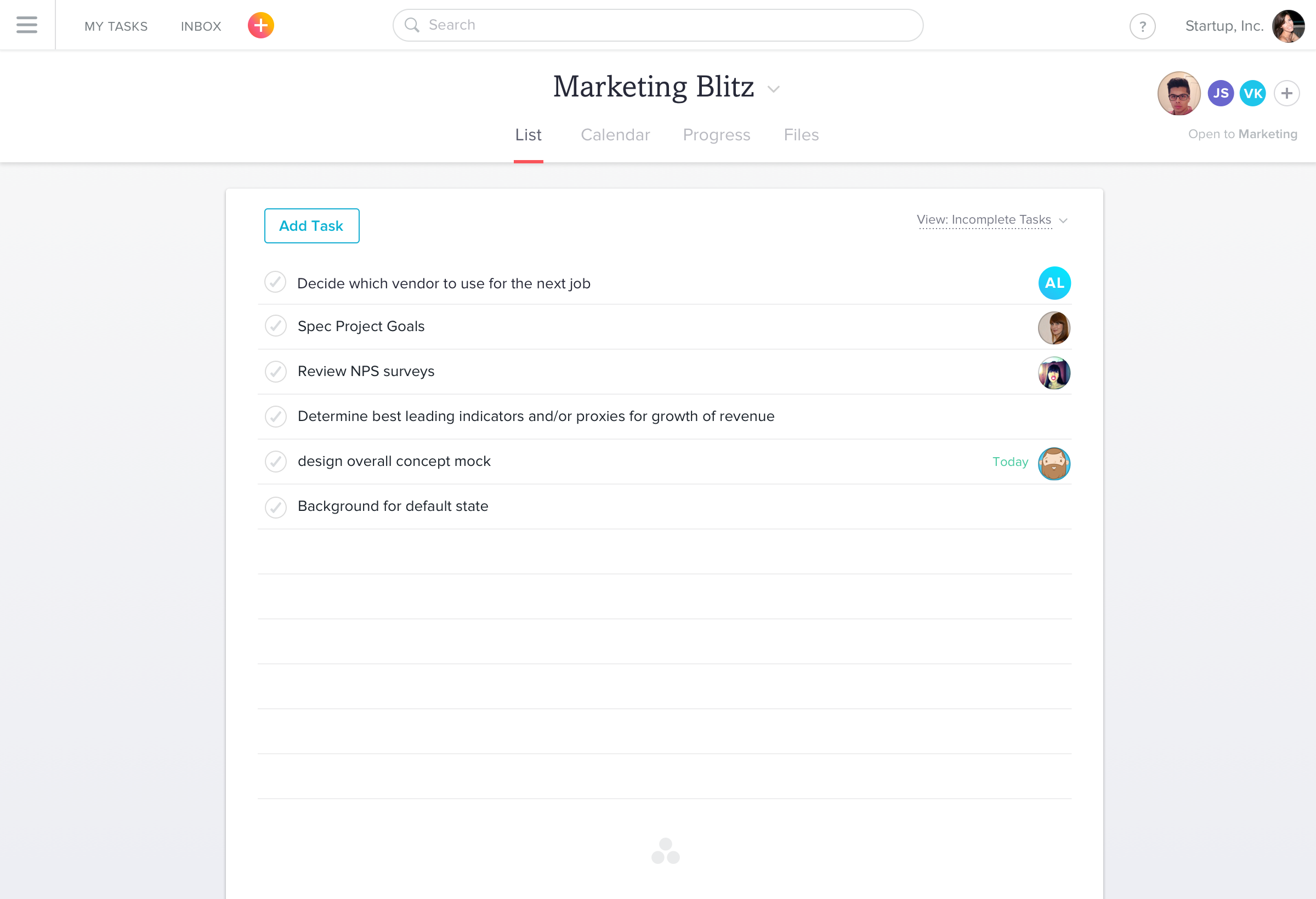
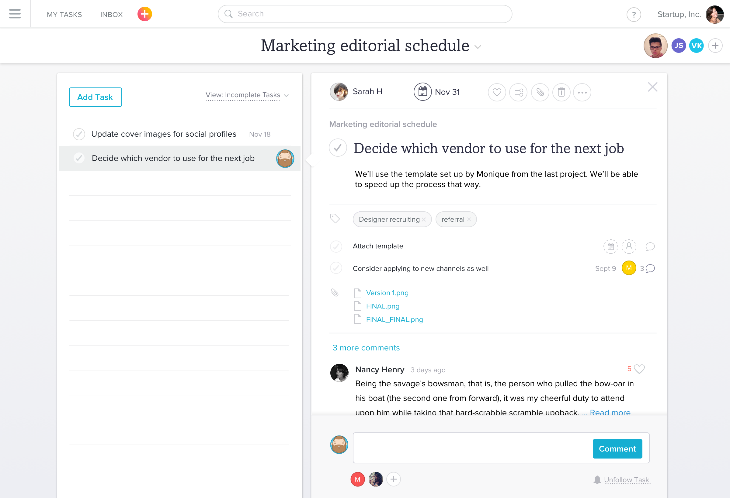
An Asana project showing the Project Overview on the right. Users were confused by the hierarchy and we were constrained by our two-pane model
User impact
Many of the new features that we were adding were aimed at new sets of users. Calendar views were useful for deadline-based teams; Project Overviews were for managers and executives; and Conversations brought in stakeholders on a project. Each of these new users was unfamiliar with the UI paradigm and often found it difficult to find the information they were looking for. We received a number of reports from customers that the product had grown complex and crowded, and it was no longer easy for them to find and focus on the information they needed.
Approaching the problem
Since several launched features had struggled with the architecture, the team had a few explorations towards solving the specific problem the feature was having. We used these projects as the basis for understanding the needs of a new product architecture. During one of my projects, I developed several concepts aimed at creating a more robust space for our growing feature-set.
A few early concepts for flexible systems that would improve hierarchy and navigation as we added more functionality
Embarking on a redesign
Once we all agreed that it was time for us to schedule and fund a redesign, the entire team gathered to discuss potential solutions. To get us started, I created an object map to get a better sense for the kinds of information we wanted available and where. I also made sure to focus the map not just on our current feature set, but on potential areas we saw the product growing. This ensured we were creating something extensible and focusing efforts in the most worthwhile area.
Using the map, a clear set of goals, and some personas provided by our User Research team the entire Product and Design team went on an off-site to discuss and explore our ideas.
Some of the varied ideas and themes generated by the design team during the offsite
Testing ideas
The team explorations surfaced a few key differences in opinion. Some of the designs were focused on a tabbed navigation separating types of content and relying on whitespace to create focus. Other concepts created a deeper hierarchy and relied on cards and panels to solve the issue around visual focus.
Since the decision to use cards vs. whitespace was central to the framework, we did some initial sessions with users to gather feedback. Through these discussions we learned that cards not only helped people more quickly understand the organizational structure of the page, it also created a friendlier and approachable feel.
Iterating with panels and cards
As the team began to adopt panels and cards for each page design, in combination with the tabbed framework for separating content, we were struggling with finding a framework that worked across the product. We needed to be able to vary width based on content and have a consistent place for the page title. Additionally, the panel concept created too many unnecessary containers.
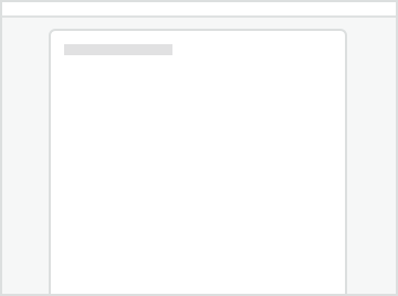
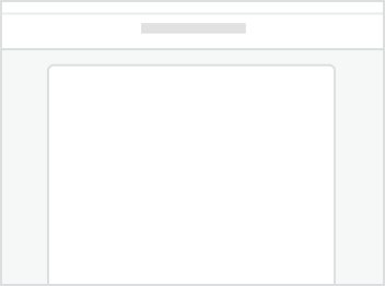
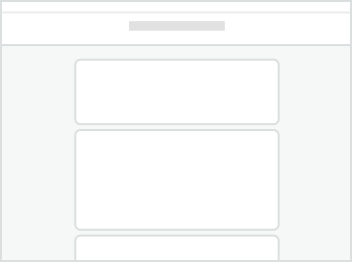
Panels were proving to be less flexible than we needed
Overall, it was becoming clear that the use of panels as suggested was actually pushing us back into the confusing page hierarchy we had, instead of opening up possibilities of new kinds of views.
Getting unstuck
Whenever I find myself, or a colleague, stuck on a problem I try to take a step back, look at the goals we set out and make a list of the constraints we believe we have in front of us. Often times, the comments someone made in passing or the initial direction someone chose is mentally being treated as a constraint when it may not be.
In this case, I discovered that by designing the screens starting with the list view and moving on from there, we were inadvertently narrowing in on concepts that worked best for that view alone and trying to apply it across all views. Here I prompted the team with a question:
Prompt
What if Asana hadn’t begun its life as a task list, but instead was a calendar, board, or file viewer? How would we design it then?
Launched solution
Once we removed that constraint and moved the page title from the primary panel, we were able to create a clear page hierarchy that was consistent across all pages and views as well as creating a system that was easier to work with and extend.
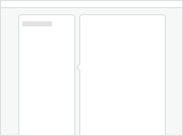
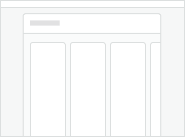
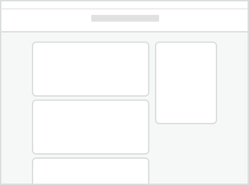
Page layouts using panels, everything but the list layout is awkward
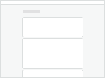
Page layout with static page title, layouts are more flexible
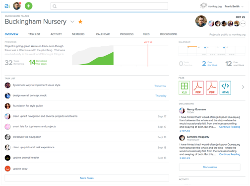
The page hierarchy now had clear identification, a place for project-level content, and the ability for content of any type be shown within. The list view was still clear, but now the calendar could be as wide as we needed, modular content could go on cards, and the not-yet-built Boards feature could scroll horizontally.
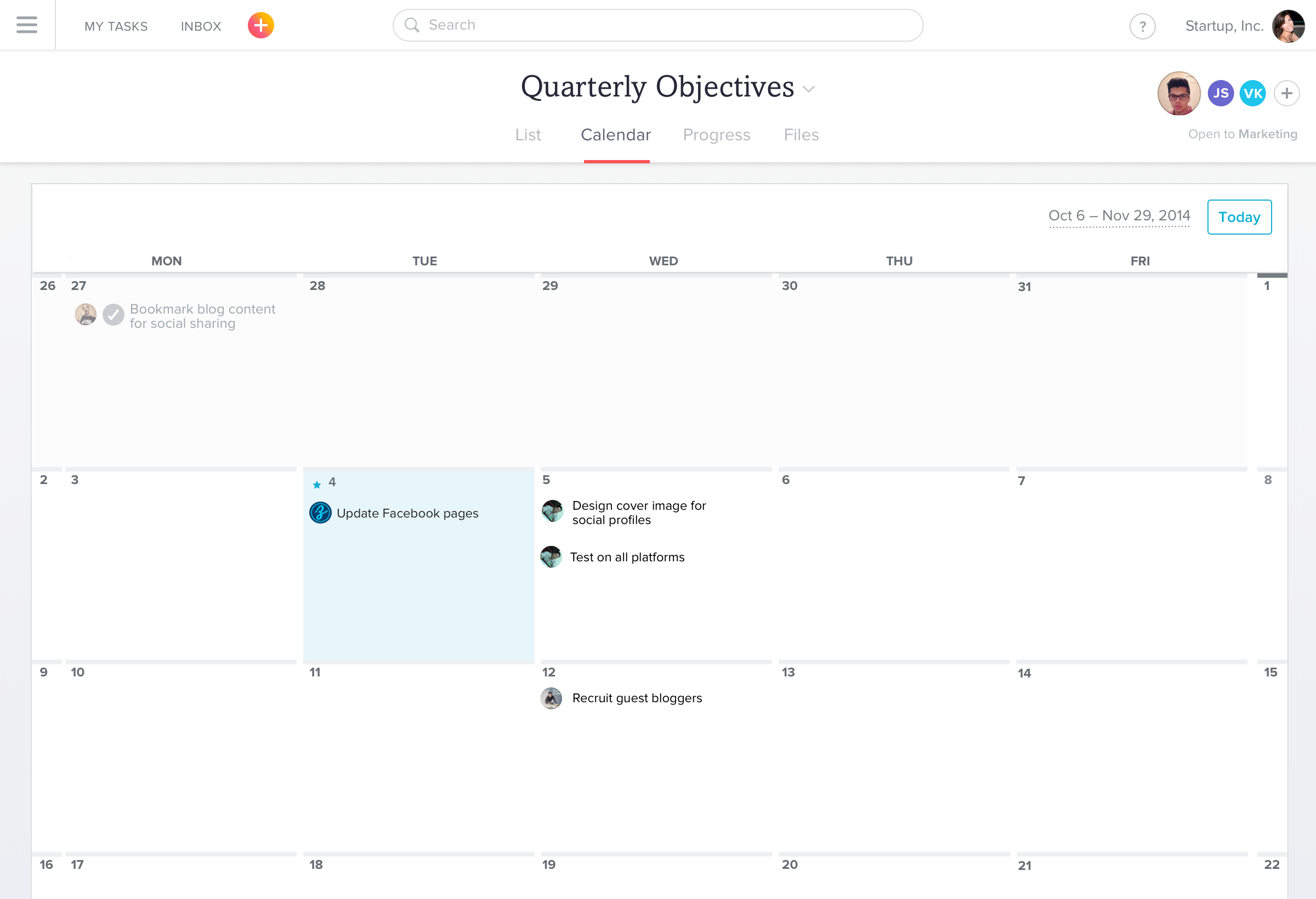
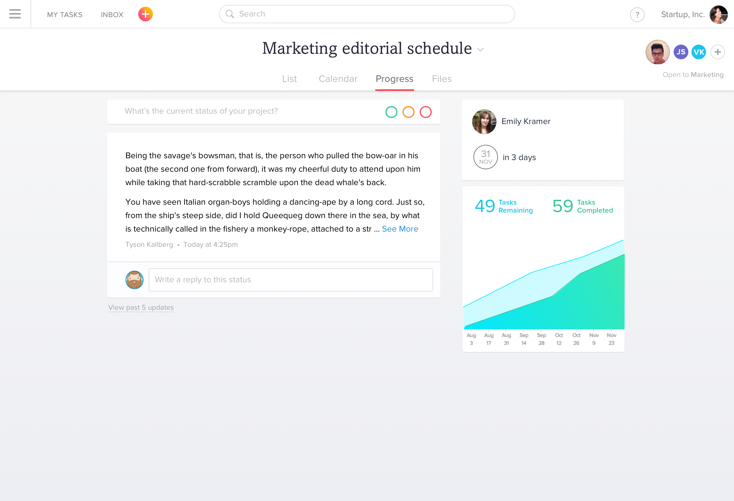
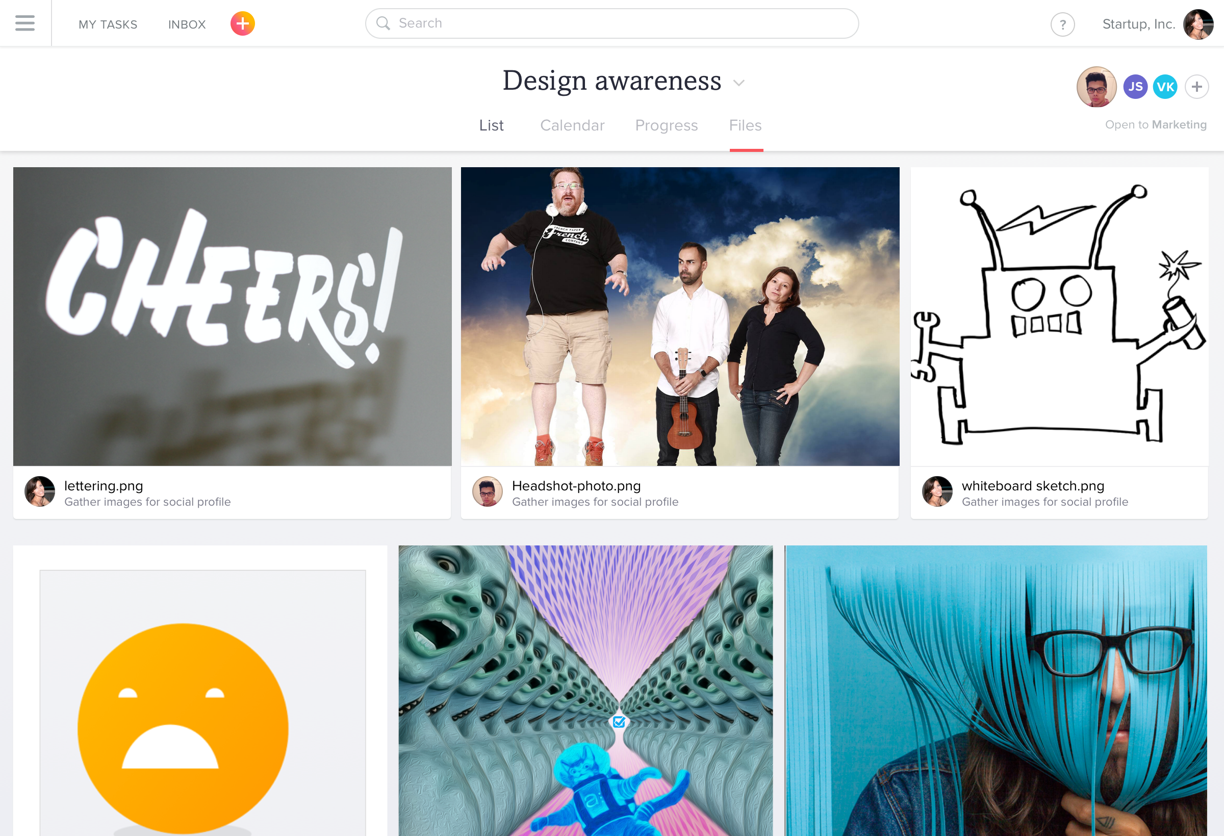
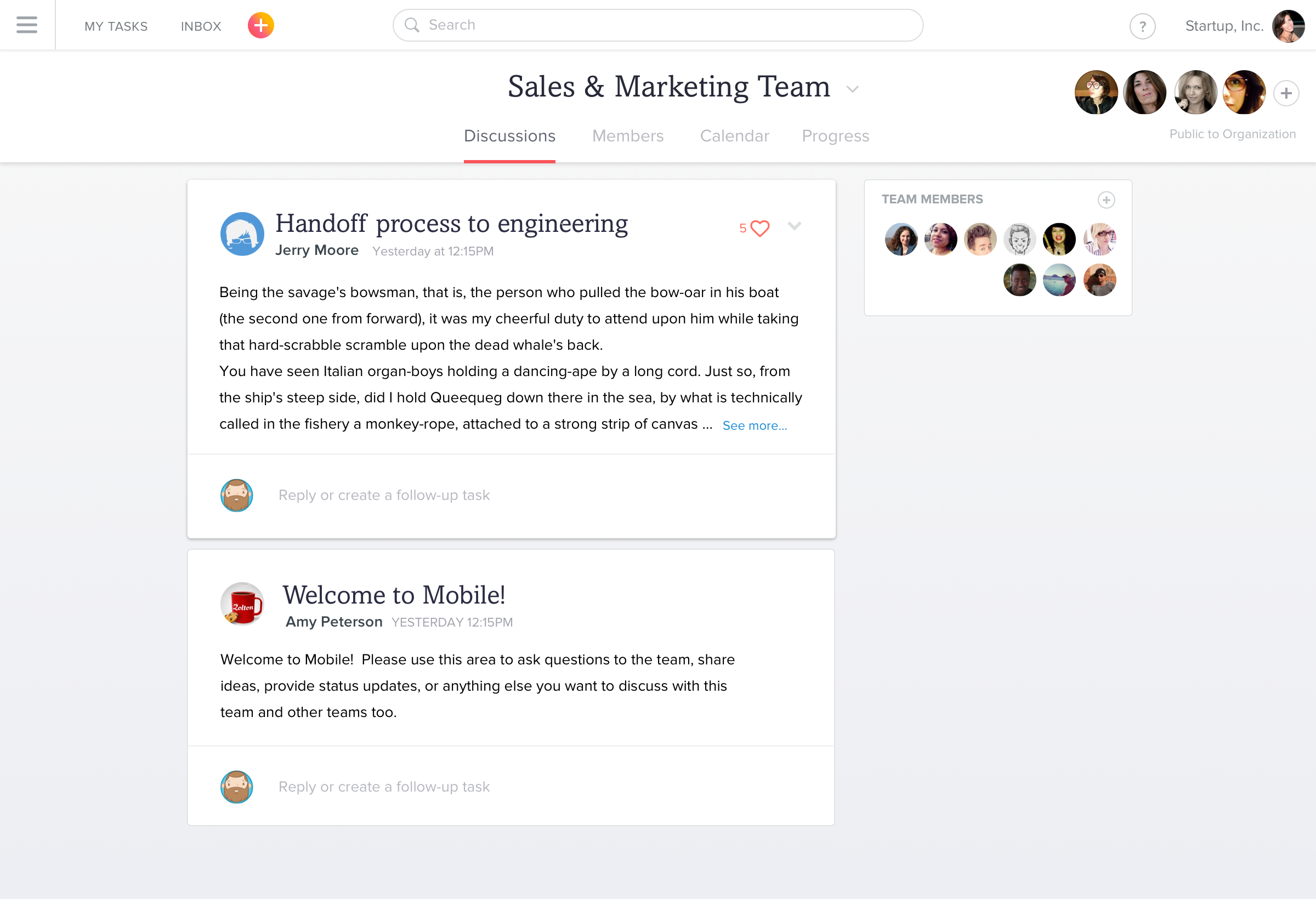
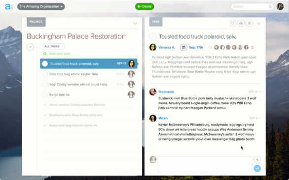
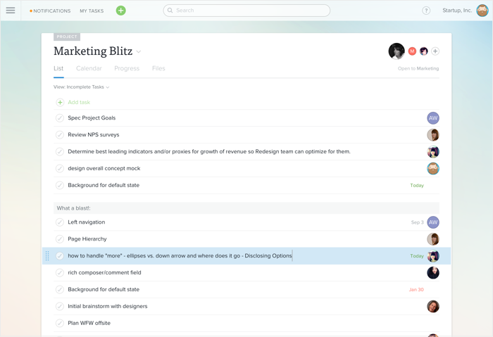
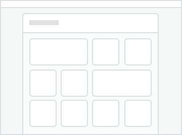
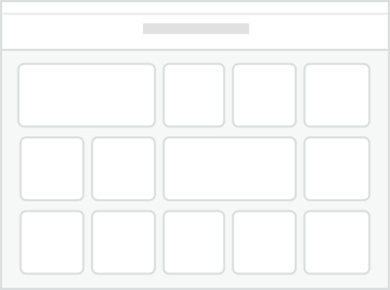
A selection of page layouts using the new grid system.
Included is the original list view, along with calendar, discussions, file viewer, and progress reports.
Results
The architectural changes we made were part of a larger redesign launch. We chose to launch the changes with great fanfare, but with the ability for our customers to opt-out if they weren’t happy with the change.
By the end of the first day of launch, only half a percent (.5%) of all our users had chosen to stay with the old design. We also heard many reports of excitement that we had added so many new features, when in fact, we had only made them more accessible – a true measure of an architectural change.