Asana organizations
2013
One of the largest feature launches at Asana, Organizations was aimed at medium to large businesses by providing more robust permissions, easier sign-up, and a stronger content hierarchy. By completely updating the way users connected to each other and their content, this project resulted in an immediate doubling of revenue, exponential user growth, and allowed us to shift towards the enterprise-level customers that would help us maintain a stable business.
Defining the problem
At the most fundamental level, Asana’s success as a business is dependent on how our customers share their content with their teammates. Sharing not only impacts how well they can collaborate on projects, thus how well the product works for them, but also the overall growth of the product itself.
However, as an enterprise SaaS product, increasing growth and sharing aren’t quite as simple as sending mass invites and leveraging pre-existing networks. We needed to take a deeper look at our product and make some changes. We identified a few key problems related how our customers were sharing and organizing their content.
Low invitation rate
Teams weren’t inviting many collaborators, and if they did they tended to set up new workspaces for different sets of people. Workspaces tended to be restricted to an individual’s immediate team, which is rarely more than 10 people.
Hindered collaboration
As a business, our mission was to improve the collaboration within and across teams. We were finding that many customers weren’t sharing their content with other teams, and many didn’t know that other teams were even using the tool. In some cases, duplicate workspaces were being created, which siloed content and hindered collaboration.
User requests & complaints
We heard many requests and complaints from our customers about how this split workspace organization impacted their use of the tool. It made the UI cumbersome to navigate, payment difficult to manage, and sharing and combining across workspaces impossible.
The data model for an individual with multiple workspaces. Each workspace is completed separate, as if they're attached to different accounts.
User impact
While this problem impacted most of our customers, we found that the longer and more heavily someone used the tool, the more cumbersome the UI became and the more control they wanted. Customers who had been using Asana consistently for more than a three months and/or had a team of more than eight people tended to need more organization and permissioning of their content. It was especially impactful for the person in the Project Manager role, since they tended to have many workspaces and needed to be aware of the progress of their projects daily. Duplicate workspaces and problems cross-collaborating were worse in larger companies – exactly the kind of company we wanted to appeal to.
Digging deep
In order to better understand the motivations behind the behavior and requests we were seeing, the PM and I partnered with our Sales and Support staff to find customers who were good candidates for research. Through these conversations we discovered that many of our customers wanted more control over who could have access to their workspace for two distinct reasons:
User motivation
- They didn’t want everyone to see all their work because they didn’t want to deal with too many questions or opinions
- They didn’t want other team’s projects to create noise in their list of projects
Setting requirements
Looking at the problems and customer motivations, we laid out some specific requirements for a new unified architecture. We also talked to our internal stakeholders to ensure we covered our bases on business needs.
User requirements
- More control over what people have access to
- Ad-hoc sharing with different people
- High-level views across groups of tasks
- Team discovery
- Management of payment from a single place
Business requirements
- Upgrades shouldn't be dependent on an entire organization
- Openness and transparency should be the default
- Inviting should be easy and clear
Competitive research
We looked closely at the growth strategies of similar SaaS products, like Yammer, to see how they were able to spread across teams easily. Some products were invitation-based while others auto-joined by email address.
Members of the team were nervous about creating networks based on email address – invitations were safer and less complex to implement. It also made it more difficult to handle member-count, which was key to our payment model. We all agreed that we did not want to pivot to a Yammer-style model where IT departments were “strong-armed” into paying for the product in order to get the appropriate security on a product their company was already using.
I felt strongly that the simplicity of creating a “Network” based on email address would encourage cross-collaboration and transparency within organizations with as little effort on the part of the user as possible. It seemed to solve for both our mission of transparency and improve the user-experience at once! Through many discussions with stakeholders and agreement on priorities, we were able to move forward with a model that didn’t hurt our revenue stream or our relationship with our customers, but still auto-joined signed-up users to their correct Organization.
Identify key user flows
Since this was a large project, it was important to discuss and identify the key flows the user would go through in interacting with this part of the product. The first step was to write some user stories to help identify who our user was and what their motivation was behind the actions they’re taking.
Example user stories
- As a team lead, I want to make sure the right people have access to my workspace so that they have visibility into the projects we are running
- As an IC on the Marketing team ,I want to see what the Design team has on their calendar so I can plan my projects
- As a new user, I want to see what teams currently exist so that I can find information when I need it
Then for each story, I’d sketch a basic flow to help uncover key steps, ensure the flows aren’t too cumbersome, and helps direct some design decisions.
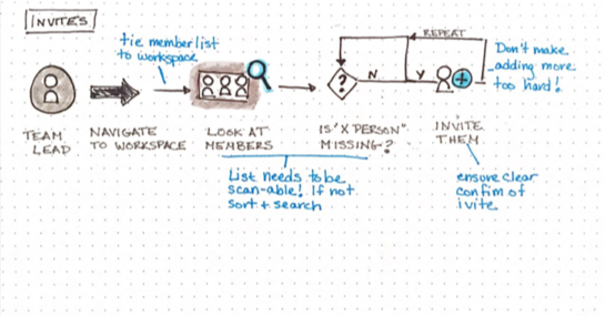
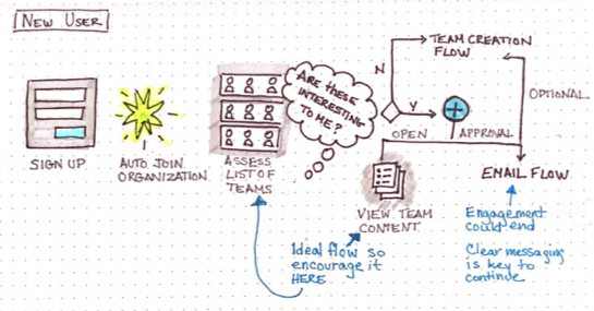
A few sketches which highlighted key areas to focus on and uncover more questions.
Identify constraints
Having clear constraints, or boundaries, when you start a project can be a double-edged sword. In some cases, it can help direct solutions away from being too difficult (or impossible) to implement, but other times it can prevent creative thinking by saying NO to quickly. This is always a difficult line to manage, but I made sure to maintain close collaboration with engineering throughout the process to keep things at the right level of exploration at each point.
In this case, we identified a few constraints which guided us away from building new screens, and instead pushed most of our functionality to the navigation bar on the left.
Launched solution
Our final solution was to create a level of user management and payment above the workspace, that acted to mirror the organization -> team model in the physical world. This would allow our current users to move their current workspaces that were modeled around teams, into a network of teams, without losing the control and organizational structure they had, but gain the ability to move, share, reorganize, and group content. The network would also provide a way to discover teams that already exist, and request to join them if they were invite-only.
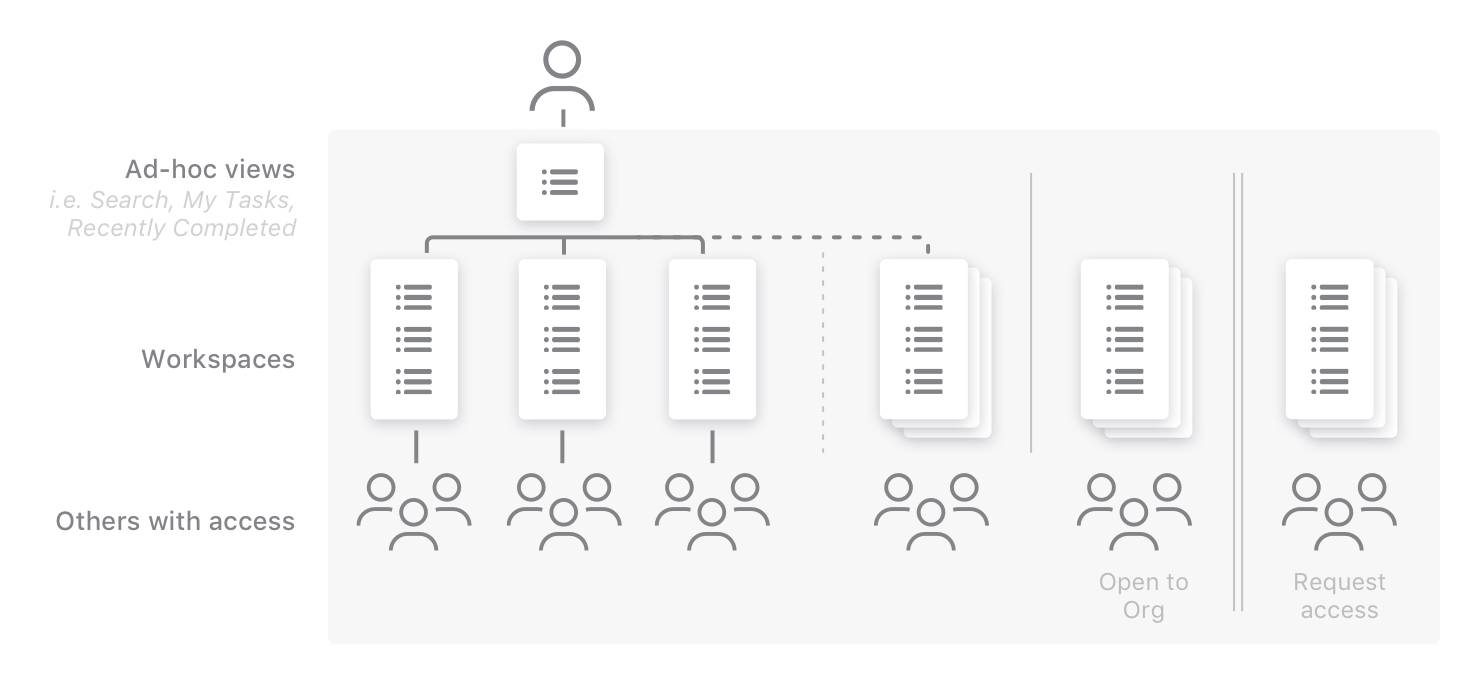
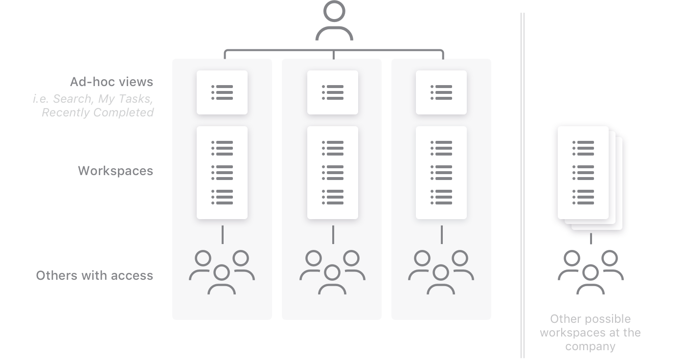
The new Organizations model, as compared with the previous model.
The new model adds an outer layer of permissions and access, making it easier to discover and share.
UI changes
The new model meant that we needed to add an extra layer of hierarchy to the UI. Since each group of projects was associated with a group of people, we created "Teams" to combine the two concepts. To encourage sharing content, we also made the "Team" more about people and encouraged inviting when teams were small in size.
Discovery and transparency were key to our goals around improving collaboration, so we built permissions to continue to default to public on teams, but didn’t automatically join everyone. This meant that members of the organization could find the content if they looked for it, but it didn’t necessarily encourage participation by pushing content to users.
The navigation area also includes the ability to see and manage the people who have access as well as discover other teams to join
Results
This project not only completely changed how our most important customers used our product, it also upgraded our value in the market. We were no longer a tool popular with startups or one a few random teams in an organization used surreptitiously. By simplifying the way membership and access were managed, larger organizations, and their IT departments took us more seriously and some began to roll us out company-wide.
In fact, immediately after the release of organizations, the new payment model meant that our revenue doubled immediately and, along with our user base, continued to grow exponentially afterward.
All in all, this project opened up doors into larger, more stable organizations, such as NASA, NY Times, Simple Human, and Google.