Selected work history
Design Manager 2016-17
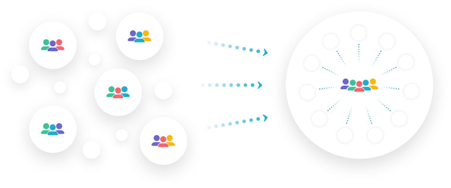
Mixpanel is an analytics tool aimed at digital product teams to help them better understand their customers’ behavior. Unlike many tools in the space, Mixpanel works cross-platform and beyond purchase flows, to help complex products understand engagement spanning the entire user journey.
As the first design manager, my main responsibility was to evolve to the role of Design within the organization. Prior to joining the team, the majority of the product decisions were made by the CEO and the role of the designers on the team was to make it sing. Through my time here, I more than doubled the team size, built out a new Communications Design discipline, introduced user research, and championed Design’s transition out of production-focused work and into the solution-space.
Product redesign
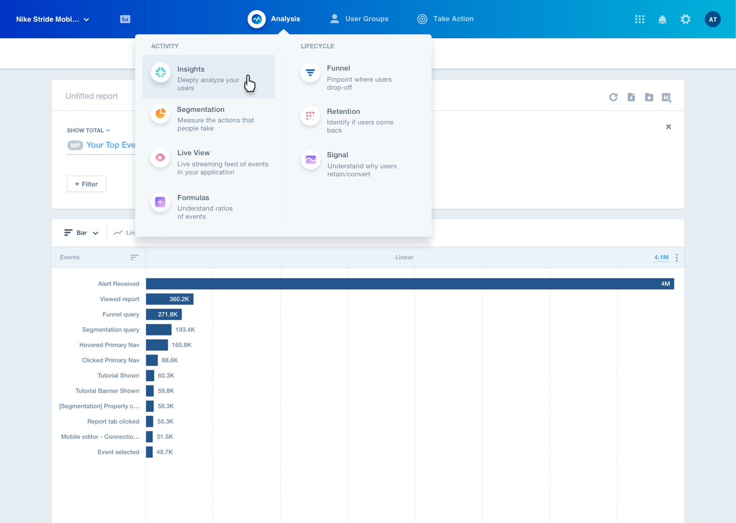
The Mixpanel product architecture and visual design hadn’t changed much since 2010, and it was becoming clear that we needed to do an update. I drove the strategy for determining our path through this process, from discovery through launch, and completely changed the way the organization launched products along the way.
The redesign resulted in increased engagement in most of our reports (ranging from 9% to 300%!), as well as a cleaner and more up-to-date visual style to more closely match our marketing properties.
Lead Product Designer 2010-15
Asana is an enterprise collaboration tool aimed to help teams work together effortlessly. Teams of all shapes and sizes can manage projects, hit deadlines, and have clear responsibility over their work.
As the first designer at Asana, I saw the company from pre-launch to over 140,000 companies actively collaborating on the platform everyday. I was responsible for our enterprise product strategy, developing our design language, and updating the architecture as our product grew more complex. As the team grew, I also ran our recruiting process, developed systems for collaboration within the team, and partnered closely with Product on feature prioritization and strategy.
Design language
Like most products in their early stages, the first few years at Asana we were a small team focused on shipping features and determining what we needed to do meet our initial customers’ needs. We weren’t building a brand or focused on scaling — as we shouldn’t have been at this stage. But as we succeeded in building our user base, it became clear that we needed to shift our focus to a longer-term vision of who we were. As part of that, a stronger brand and design language had become necessary to bold express that indentity externally, and help us move faster and build alignment internally.
Redesign architecture
As Asana grew in functionality, we were finding that the early simplicity of the product no longer held true. Users were having trouble finding features, and reported a general feeling of being overwhelmed. We had a vision of being a powerful and flexible tool, so we knew we needed to do something to make the experience more extensible, give our users the features they were asking for, and prepare to better meet the needs of the larger and more traditional companies we had begun to attract.

Organizations
One of the largest feature launches at Asana, Organizations was aimed at medium-to-large businesses by providing more robust permissions, easier sign-up, and a stronger content hierarchy.
By completely updating the way users connected to each other and their content, this project resulted in an immediate doubling of revenue, exponential user growth, and allowed us to shift towards to enterprise-level customers, such as Google, Uber, Deliotte, GE, NASA, and the NY Times.
